
Qualities of Legibility
To learn more about typography, I chose legibility for my project topic, and compared English alphabets and Chinese characters. I believe that an understanding of legibility can enhance the use of fundamental elements in design, like letterforms.
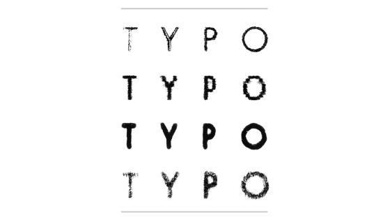
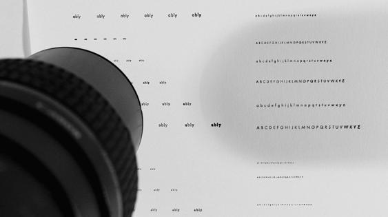
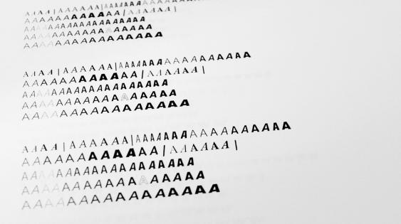
Written English uses symbols to reproduce the process of pronunciation represented by linear text. In order to achieve efficiency in use, these symbols have been simplified by omitting anything unimportant or unnecessary. Letterforms are an easy and practical way to recall each symbol, and help us write efficiently. The simplification, however, causes a lack of distinction among letters. Homogeneity in letterforms is a legibility defect.
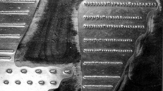
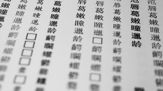
Alternatively, written Chinese uses symbols to represent things, phenomena, and ideologies, which is an icon-creating process. Our ancestors attached additional information to kanji when they tried to incorporate the essence of phenomena and ideologies, resulting in a complex system of glyphs which are harder than letters to remember and write. Yet, these icons enable the conveyance of two layers of communication—illustration and meaning—through these written symbols.
If legibility is primarily founded on the standards of form, function, and custom, then every culture must necessarily espouse different standards of legibility. Custom heavily influences our conception of legibility, which is derived from our reading habits—that is, the measurement of legibility is likely to evolve culturally, with different cultures having different standards as a result of differing reading habits. As a result, the measure of legibility differs among language systems as well as among cultures.
This journey of writing and designing has provided deeper insight into two very different languages and the qualities and issues of legibility embedded in each writing system.