Waltzing Typeface
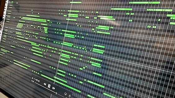
My thesis topic is musical notation. Over the past two years I’ve looked at various forms of notation, alongside the evolution of and processes for creating these systems. Piano roll notation is one such form. In the early twentieth century, piano rolls provided a way to both record and replay a piece of music. Anyone could insert a roll in a player piano and listen to a piece of music as if the musician were playing it in the room. Recently this notational system was translated to broadly accessible digital formats—piano roll notation can be found in music editing programs such as GarageBand and Finale.
My project investigates a way to combine type and music. It considers both sounds that are made and letterforms that can be read; it brings the auditory and visual form of type together.
My interest in combining type and sound reflects my interest in dualities and my desire to investigate the space between disciplines. I’m interested in combining old technology with contemporary software, historical letterforms and modular digital formats. I’m interested in experimentation: setting up parameters, without a preconceived idea of the outcome, and seeing what happens. In this project, I hope to bring letterforms and music together to record these experiments.
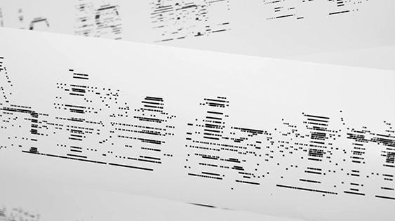
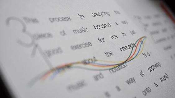
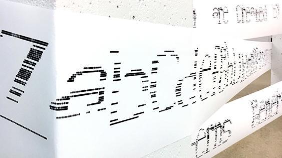
I’m interested in exploring the nuances of letterforms through music. Music is difficult to capture visually, and musical notation provides a way to capture the undefinable. In this project, I used GarageBand to develop letterforms. The notation provides a structure within which modular letterforms can be constructed — and these experiments yield outcomes that are both formally and auditorily unexpected.
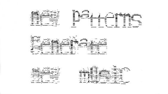
In the project, I modified traditional letterforms according to the sound of a piece of music. I chose to focus on a recognizable, classical piece—“The Blue Danube” by Johann Strauss Jr.—so viewers might be able to recognize the way that the piece had changed. My final project includes three typographic cuts.
In the first cut, I pushed the limits of typographic legibility and focused on retaining as much of the original music as I could. In this case, form follows function—and the form of the letters are a direct result of what happens in the music.
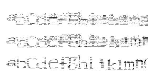
In the second cut, the opposite occurs, and function follows form. Here, the form of the type is more important than the sound of the music. I developed letters based on Stempel Garamond—a typeface often used for labeling piano rolls at the height of their popularity—while considering the music’s sound, so that the letters still make melodic sense.
In the final cut, I layered the first and second cuts together to form letters that have a more legible outline yet also function musically.
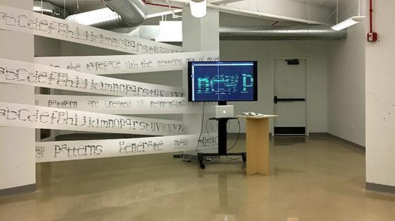
In the video and posters, I combined letters in sentences—thus re-sequencing letters and creating a new version of the piece of music. My book combines Risograph printing and newsprint which help the publication feel modest and easily accessible, and connect to my choice of GarageBand, a populist software.