Deconstructing and Combining
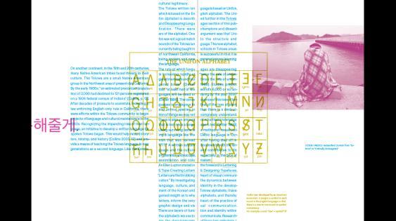
An alphabet is a powerful instrument of visual communication against the elimination of culture and identity. It provides not only the ability to read and write but also enables the documentation of thoughts. It is a vehicle for self-expression and the empowerment of a people.
The Korean alphabet combines philosophy, history, and semantics, consolidating and simplifying them through design. This approach deconstructs convention and develops a structure or system which facilitates communication. The Neo-Confucian principles embodied in the Korean alphabet’s compositional structure—including directions, elements, sounds, and the idea of bright and dark—allow the connection between communication and philosophy. Graphic design gives form to our ideas. The Korean alphabet shows that it can also generate ideas and give us a voice.
Like the consonants, the vowels in the Korean alphabet are divided into two groups, related to the Neo-Confucian ideology of eum and yang. Eum represents “dark” and yang “bright”; bright vowels can give a bright, cheerful, and dainty impression, while dark vowels connote things that are dark, melancholic, heavy, and large. When the dot in a Korean character is placed above the earth (represented by a horizontal bar), it is bright; when placed below it is dark. When the dot is placed to the right of Man (represented by a vertical bar), it is bright; when placed to the left it is dark.
I am interested in the idea of deconstructing and constructing complex and layered ideas by breaking down meaning, creating something seminal from that deconstruction, and then building deeper meaning through complexity, depth, and layering.
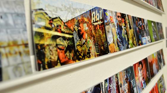
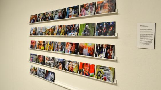
My research into Neo-Confucianism led to the idea of complementing opposites and the principle that everything is interconnected. To apply and explore this in her masters project, I incorporated ideas of structure and randomness by deconstructing and recombining news headlines and images from multiple cultures and newspapers over a month-long period into a projected, interactive piece.
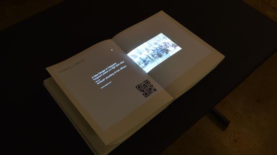
My masters book incorporates the idea of directionality; I used five colors to group different kinds of texts, and built on this directionality to develop layered systems for text, titles, images, and secondary narratives. The book’s format references the idea of interconnectedness—it is a book that cannot be closed. The book’s dimensions are related to the proportion of hexagrams, a visual manifestation of Neo-Confucianism. Seeking to simultaneously explore utility and beauty, and to honor the utilitarian features of the Korean alphabet, the typeface Calibre, a utilitarian font derived from street signs, was used in both project and book.