Autopoietic Typography
“Letterforms frame the message; they place the content in historical and cultural context. While the canons of readability and legibility are usually stressed, fonts are rich with the gesture and spirit of their own era.”*
In my masters project, I analyzed the work of three type designers (Eric Gill, Adrian Frutiger, and Radim Peško), and the ways historical events, technology, and personal interests shaped the typefaces they designed over the past 100 years.The discussion includes investigation of the prerequisites of a lasting typeface, and why each of the fonts documented is considered successful.
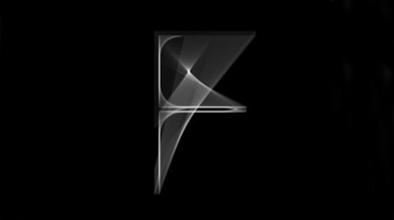
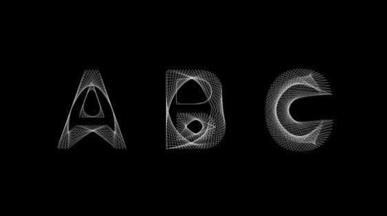
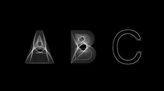
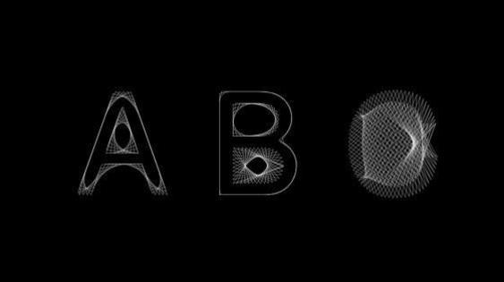
Using processing to illustrate the meaning of autopoiesis, a system capable of self-reproduction and self-maintenance, I then developed a typeface that regenerates itself repeatedly. Drawing on my own family history of locksmithing and interest in mechanics, technology, and multiple components, I designed a series of digital posters which use processing to generate continuously changing letterforms to demonstrate the typeface’s use.
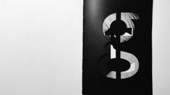
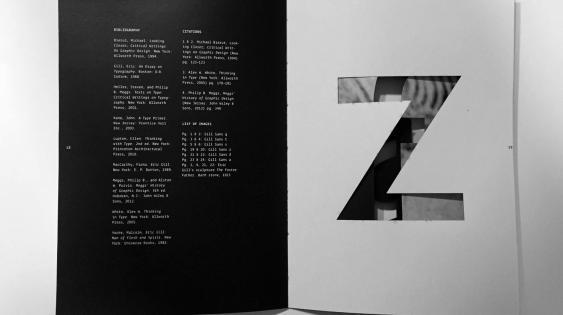
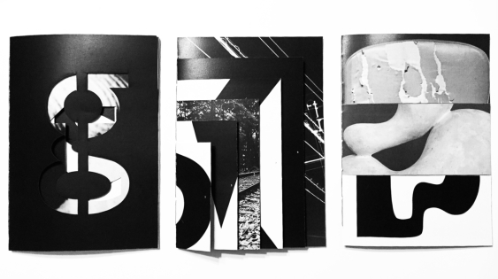
This project includes three books, one for each of the type designers researched. Eric Gill studied architecture, sculpture, calligraphy, painting, and stonecutting. He believed that work has spiritual value and that artists and craftsmen serve a human need for beauty and dignity. To reflect these qualities, the book is monochromatic and incorporated lasercut letterforms, giving the book a sculptural, monumental quality.
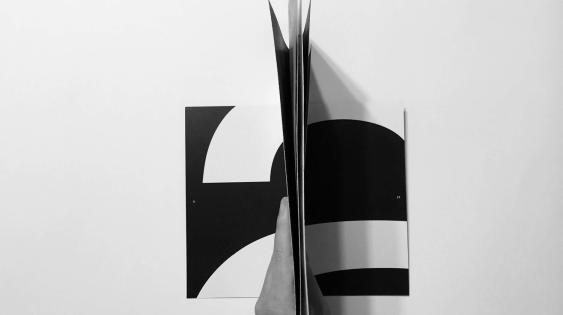
Adrian Frutiger was fascinated with mechanical objects, processes, and electricity. His Univers typeface included the design of a numeric code system that used numbers instead of names, with the first digit indicating weight, the second digit indicating slant, odd numbers noting roman families and even numbers italic. My book on Frutiger reflects his interest in variation, and includes 6 nested sheets of varying sizes, allowing the images on opposing spreads to align when viewed from above.
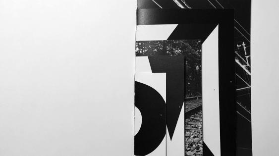
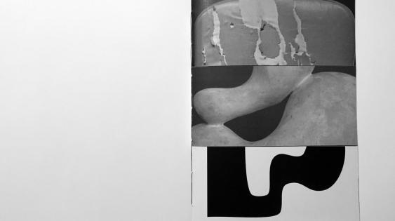
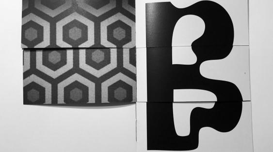
Radim Peško’s typefaces take on the combined traits of physical objects and personal interests. His typeface Fugue incorporates a funky, flawed geometry and is closely related to Futura. Another typeface, Lÿno, is a family consisting of four fonts: Ulys, Stan, Walt, and Jean; each based on the feeling or essence of the artists they are named after. Kristin’s book is divided into 3 horizontal bars to allow an interplay of cultures and influences, reflecting the designer’s ability to take multiple sources of inspiration and incorporate them side by side.
*Beirut, Michael. Looking Closer: Critical Writings on Graphic Design. New York: Allworth Press, 1994