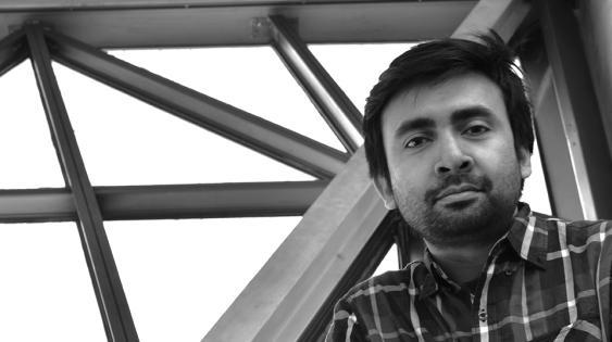

UIC: Muhammad, what is your masters topic?
Rahman: Occupying Space
Why did you decide to focus on this particular topic?
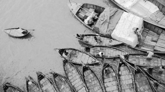
My undergraduate degree in architecture, my background and experiences learning from Bangladeshi culture, and my photographic explorations contributed to my interest in this topic.
I focused my masters project on environmental design and the formal qualities of letterforms by blending architecture’s formal language with graphic abstractions of space. I’m very interested in environmental design, because it combines architecture and graphic design. In my undergraduate studies, I focused on architecture. Now, I’d like to expand that knowledge to include graphic design and enhance my ability to explore interests in spatial design and typography—this is the main reason I am here in this program.
Why was this topic’s exploration important to you?
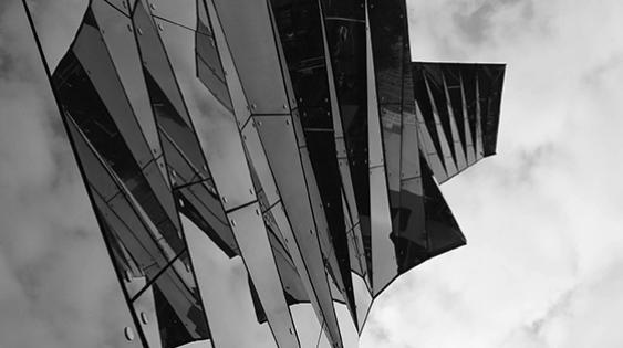
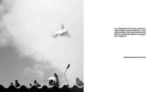
I wanted to claim my own understanding of space in design. I am inclined to abstraction and architectural photography; visual depth and meaning. I am passionate about composition. Through this project, I want to claim the philosophy behind my design, and announce my visual language, to clarify that this is what I do, and that this is how my design is different from that of others. It will definitely give me more confidence and act as a momentum in my future work.
That’s why I use the word “claim.” Claim inspires me to improve my work. It’s related to form, function, and personal experience. Intuition is a vital aspect of my design; like handwriting, it’s something you have and is hard to change, because it is an intuitive and spontaneous style of your own.
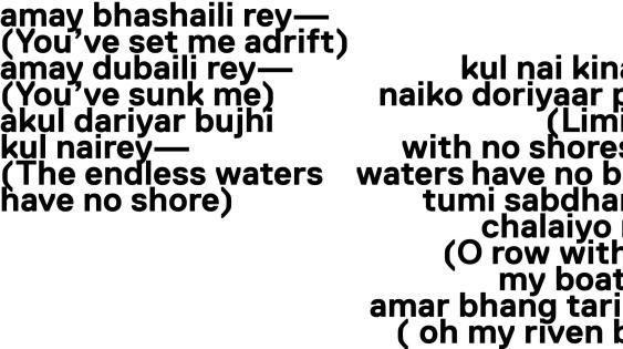
”Occupying space,” my masters book, celebrates my keen interest in exploring graphic design, things and objects that exist in space and the quality of their display; “Revisiting space,” my masters project, documents the way I create work by investigating the spatial arrangements of my earlier photographs. The masters book describes my personal journey; how I think about space. I tried to compose my book accordingly, relating my understanding of depth and form.
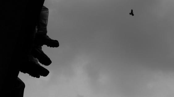
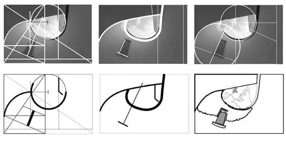
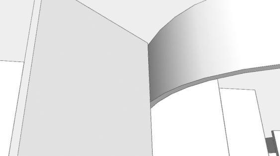
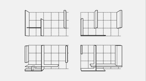
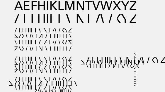
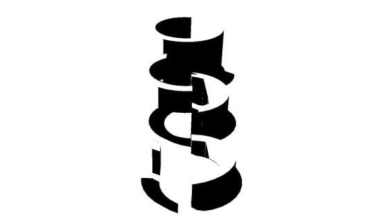
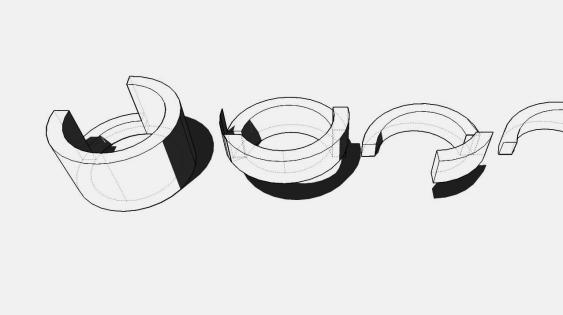
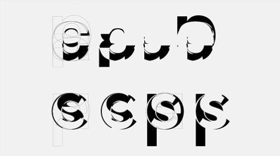
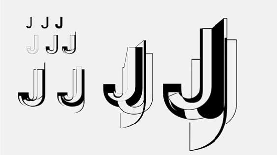
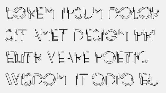
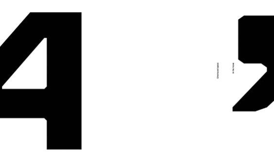
Typefaces and letterforms are essentially flat, two-dimensional. I was eager to abstract form, creating a typeface with a spatial context and physicality. Through abstraction, I tried to reference the essence of architect Ludwig Mies van der Rohe’s spaces.
My intention was to blend the legibility and the essence of Miesian spaces by investigating Mies’ ideas of proportion, minimalism, and volume. As in the oft-quoted axiom “Less is more” I tried to explore typographic legibility with minimal elements while at the same time, referencing the essence of Mies.
The three words I picked in Meghan’s class about myself are intent, the poetic (personality), and wisdom (as opposed to knowledge, which is something you’ve read and learned, wisdom is something that you feel and spontaneously use). Whenever I design, these are the three words that drive my design work; that help me claim what and how I design.
What did you learn at UIC that you didn’t in college?
Since I didn’t study graphic design as an undergraduate, UIC taught me a kind of typographic grammar that elevates design and gives it importance. Before, I never thought of typography as serious or important. Now that I understand typography’s predetermined rules and how to apply them (or disregard them), typography takes on more meaning.
What do you like most about the MDes program?
The diverse ways one can learn, experience, and apply design knowledge. I also appreciate the chance to be exposed to different students’ and projects’ design, the freedom to explore, and the ability to build a sense of my own design authorship.